Jonathan White
UAL Extended Diploma in Creative Media Production & Technology
Candidate Number: 319325
Logging footage
Welcome to the post-production page! After having completed the production stage and filmed/recorded all required elements for the final film, I need to actually piece it together. This starts of with logging the footage; going through each file recorded and noting their descriptions down with a note suggesting their suitability for the final edit. I have used a colour coding system in the notes column to make it easier for me to identify the good and bad clips. For many of these clips, I have also made more detailed notes that state the timestamp at which I should go from - this is because some of these clips can be quite long. After logging the footage, you will then see me reach the editing process stage where I bring it all together and produce the final video!
Logging Day 1

Logging Day 2

Logging Day 3

Logging Day 4

Logging Day 5 + 6

Logging Day 7

Editing Process
To begin the scene 1 rough cut, I ensured that all logging was complete before I started on any of it. This was vital because as I was essentially shooting a film, I had lots of takes and I knew that there was most definitely some videos that I did not want to be included due to mistakes occurring during the shoot. Furthermore, audio was also recorded separately to the camera, meaning I am going to have to sync video files with their audio files – understanding which file names fit another is very important. Having completed all of the logging (both visual and audio) I can now move onto the editing process, confidently knowing that I am not wasting time searching for files, and am able to understand that I am using the best possible takes that I shot.
The first task that needed to be completed before importing any files into Premiere Pro, was to create a new sequence with the appropriate settings. The settings that I have highlighted, in the image below, are the settings that I had to be most aware of, as these need to reflect the settings that I shot/recorded my files in. If I set the timebase to 30frames/second, my 25frames/second footage would have to adjust itself to fit 30 and would not look as smooth as it should. Evidence of this being taken place can be seen below.

Now that I had the sequence ready, I could now start to import the required video and audio files I need to start cutting scene 1 together. At this moment in time, I’m not worried about getting these files on the actual timeline, I just want to organise them neatly in the filing system inside of Premiere Pro. It’s important that I neatly organise my files because there are going to be a lot across the whole of the documentary that I need to easily be able to locate if I need them. Taking the time now to do this will save me a lot of time in the future having to find files. In order to locate the correct files I have returned back to my logging – this can be seen below.

After going through the logging sheet and importing all clips with a green tag in the notes section, I now have all files in my premiere pro project. To keep these clips separated from the documentary clips I will inevitably be importing later on, I have created a scene 1 folder – this can be seen below. I am now in the position where I am able to move forward into the actual editing section of the post production stage, which I am looking forward to very much: I cannot wait for it all to come together.


To begin the cutting process, I bought in the first four clips of the sequence and positioned the sequentially in order. From here, I will then be able to roughly cut them down and start to see it come together. The reason I have decided to only bring in 4 clips for now is because I don’t want to have too many clips in my timeline, as, firstly, it is not needed, and secondly, I don’t want to become confused by the amount of video clips I have. Keeping it clear and easy to understand is how I aim to effectively produce and cut my edit. The image below shows these clips being laid out. I will now be positioning the mouse at the start and end of clips, and dragging them to shorten them to the part of the clip I want included. This is a simple technique which is the very basics and concept of what editing is.

This is what it looks after now being cut down. It can be seen that I was able to cut what was a 01:15 video down to just 00:19. To add to this, this edit is simply just one version of the edit. There are opportunities to play around with how long shots are held for and what point I start/end the clip. Ideas that I have for different versions are that I could cut back to the main shot of the stairs, after seeing the close up, and I could also shorten the clip of our protagonist sitting down, as I did not cut this down a whole lot. The video below shows what I currently have.

Now that I had this completed, I need to essentially do the same process for the entire duration of the scene. I will be using the same technique for cutting the clips, with the additional potential technique of using the razor tool. The razor tool allows me to select a point in the clip and cut a slice in it. This clip now becomes two – this allows me to cut out a section within the clip, not just on the edge. I will be using this for the clip of the protagonist’s eye looking around the frame as I will need to use several different cut up clips from this one video file.
The first, very simplified cut of the edit can be seen below (both the timeline picture and the video). This cut does not include audio elements yet, it is simply the video elements positioned in order and cut roughly.

Speaking of audio, I am now going to include all audio elements that I am intending on using, this includes: foley sound effects for the triggers, sound effects for when the protagonist’s eye moves and music.
Gradually increasing volume of music up until the point where we first see the eye
The reason I have decided to do this is because the walk down the stairs leads up the main portion and purpose of the scene – I am engaging the audience and causing them to guess, pre-empt and prepare for what is going to happen once the music has risen to it’s loudest point. A great comparison to prove the effectiveness of this technique is by looking at the famous ‘Jaws’ (Steven Spielburg, 1975) sound track (https://youtu.be/5tMqcARKRSE). The music in this scene slowly increases the overall volume, and tempo too. We as an audience feel our heartbeat representing the tempo of the music, it gets faster and faster and we feel more and more nervous, anticipation becomes evident. This is exactly what I’m trying to do here – increasing the volume and therefore increasing the overwhelmingness of the scene should create uneasiness in the audience, representing what the protagonist in the scene is feeling.

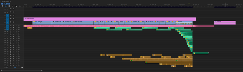
As you can see below, this is what the timeline looks like after adding all sound elements to this cut. I will be going through all of the decisions I made throughout this process as, as you can see, there are quite a lot of layers. I have categories the sound layers via the use of colour to make it easier to understand what is what. This is not only to show to you and prove my understanding, but it also actually helps me in the editing process too! With the amount of layers there are, colour coding has seemed very useful for me as I’ve been able to understand what I’m editing and where it should be positioned within the sequence.

Pink audio tracks
The pink audio track is for the music behind the scene. I made the conscious decision to place it in layer 1 as this audio track plays for the entire duration of the scene. Placing it above everything else, essentially ensures that it’s out of the way and keeps the sequence looking clean and organised. There is no need for the music to be placed anywhere else other than the very top or very bottom.
Looking at some of the creative decisions I made regarding the audio track, one of the main creative problems I had to overcome was the need to begin the track part way through the music. The reason I had to do this was because the scene length was not the same length as the music. To overcome this issue I placed two levels keyframes, one at the start of the clip and one 20 seconds later. The first keyframe sets the audio levels to -28db (a very low volume) and the second keyframe sets the audio level to -10db. -10db is the volume I have decided best fits the music: the music is simply background music, it should not be situated in the foreground or be louder than any other, more important, audio elements within the scene. Fading the music in slowly allows me to gradually, seamlessly bring it in, acting as if it were the start of the music – the audience will never know any different. To add to this, this gradual incline also plays into the whole purpose of the scene. It is played out so that the build up is 95% of the scene, with the end 5% being the climax. This idea is common in the horror genre, as it allows for suspense to occur. This tense suspense should be thrilling but anxious to an audience member.
Another thing to add is, how was I able to understand how much of the music I needed. I started with the fact that the climax of the music, the point at which it is loudest and most grand, at the end of the music is where I need it to match with the end of the video clips in the scene. To overcome this problem, by clicking ‘m’ on the keyboard, I was able to create a marker – creating a marker meant that I could line the part of the song I wanted up with the end of the clip.

Green audio tracks
The green audio tracks indicate the piano sound effects used when the eye looks around the frame. I have decided to give this sound effect its very own colour code due to the amount of clips I used from it. Throughout the main body of the scene, we keep returning back to the shot of the eye looking around the frame, meaning, sound effects were needed throughout the scene. The purpose of the piano notes are to dramatize and emphasise the movement of the eye. The piano sound effects have quite a long duration, meaning they were longer than the duration of the clip that played after it. The problem with this is that I then couldn’t place the next piano sound effects without it cutting out the end of the previous one. To overcome this issue, I alternatively used audio layers 2 and 3. Switching between the 2 layers allows me to start the next sound effect without cutting out the previous one – creating a much more seamless and enjoyable watch.
Looking at the very end of the scene, you may notice that there are a lot of tracks layered over the top of one another. This is because of the nature of the final shot, and that it focuses around the eye looking all around the frame in the same shot. It was important that I was able to keep them in order and easy to view as there were a lot of sound effects here. You can see that I have created a slide-like layer, increasing the frequency of the sound effects as time moves forward. This can be seen by the red markings on the image below. For those clips that exceeded the duration of the shot, I needed them to be cut before the end. However, cutting an audio clip before it ends can sound very strange and not good to listen to. This meant that I had to create a keyframe, and quickly, but gradually lower the volume of the clip.
I then set all of the green audio tracks to an appropriate sound level so that they are distinctly in the foreground but also not too loud so that they cause too much distraction to the piece.

Orange audio tracks
The orange tracks at the bottom of the layers are to signify those audio elements that classify as misophonia triggers. These clips are the very premise and purpose of the scene, as misophonia is all about sounds and the emotional response that those with it have to specific ones. This explains why there are 7 different layers for this category of audio. I had decided that the best way to keep track of each audio trigger was to assign each of them their own layer. This was important for not only keeping track of audio triggers like I stated, but also for ensuring that I am able to layer the sounds over the top of one another. Layering is a very vital piece of this scene, as each time the audience sees a trigger, the audio of the trigger continues to play out for the duration of the scene.
For many of the clips, I either needed to decrease or increase the volume of them. This was because particular sounds were much harder to record between -12db and -6db than others were. A specific sound that was recorded quite quietly, and therefore needed to be amplified in the edit, was the sound of eating/chewing. It was important that all sounds were at an equal level of volume, as all sounds are as important as each other within my scene. It’s important to note that these sounds are diegetic but have been tampered with in the edit so that they continue to play after hearing it paired with its visual counterpart.
For some of these clips, particularly those that have a long duration and continue to play the same clip after being featured, I have placed several level keyframes along them. With these keyframe, I changed the db levels throughout the clip, making the sound get louder and quieter, almost randomly. The purpose of this is to add uneasiness and allow other sounds to be heard more prominently too.

After having completed all of these audio layers, I now had my first draft of the scene, with both video and audio. This can be watched in the video below.
Theres a lot I like but also a lot that I think could definitely be improved upon. To begin with – the positives.
Firstly, I like the whole concept of it; I was scared whether it would come together or not, so I’m happy to see that the concept and principle of it works. I think the narrative is easy to understand - I have been able to craft a scene that an audience member can watch and know what is happening. I have been able to prove this as I have shown the cut to the two people sat next to me at college and they both state this.
I also like the black and white colour grading on it too. Bearing in mind this is a very simple colour grade with no colour correction to any clips, I am happy with how it looks. I think the black and white makes it feel a lot more eerie and uncomfortable. Creating emphasis on the highlights and darkening the shadows has allowed me to create a high contrast, disturbing vibe – which most definitely sets the scene for the piece.
Additionally, I am happy with my choice to remove the ‘shut up’ video and audio at the end as I think leaving the audience with the eye looking directly down the lens is really good and impactful – it feels very intense. I don’t actually feel as if the ‘shut up’ was needed, as I think the panic from the eye anxiously darting around shows that clearly.
However, despite the positives, as stated, there are also some negatives, or at least, some things to improve on. It’s important that I recognise these as learning curves and not something to make me feel bad about myself as this is literally the whole point about making several cuts of a scene.
To begin, the first negative is the pacing and length of the scene. As a whole, it feels very long and drawn out. I think this is really important for me to understand because I have tried to create a drawn out feel for the purpose of suspense, but in fact have just made it more boring. Particular things that I think should be changed are, the length of all shots where possible, especially the first few shots where the protagonist is walking and sitting at the dinner table: the first shot of walking down the stairs and sitting in the chair are very long. I am almost debating whether I even need that first shot of walking down the stairs at all, as ultimately, it doesn’t add much to the piece. Furthermore, the second shot (looking through the banister) is far more visually pleasing and adds to the horror-like mood I’m after. Regarding the sitting down shot, I do think it’s important to keep this because it shows he has arrived at the dinner table, but only a section of it should be used – perhaps cut the end of it off and only show the part where he pulls the chair out. We, as an audience, don’t need to actually see him sit down to understand what’s happening, pulling the chair out is enough. To add to this, I also don’t like the fact you can see a logo on his jumper when he sits down, as it doesn’t make it feel very professional. This is something I did not think about during the production, but definitely should have been.
Secondly, the audio at the very start feels too abrupt. It needs to slowly come in at a far quieter volume as currently it feels like I’ve started watching something half way through. This is a simple change to make – so not too worried about this.
Thirdly, I’m not a fan of the piano sound effects that I have added. I thought originally that adding something such as this would make the looking around the frame far more impactful, but it occasionally makes it feel quiet comedic and/or unprofessional. There’s something about it which doesn’t seem quite right. It may be because the eye does not dart instantly across frame, or perhaps it just simply isn’t needed, but I think that in the next cut I should definitely look at how it feels without the sound being there. This does not only apply to the sound effects used in the main body of the scene, but also in the final shot too when there are lots layered over one-another: they are too foregrounded and it takes the importance of the misophonia triggers away, which is not good.
Lastly, speaking of the final shot, I feel as if it needs something added. The simple act of the eye looking around the frame does not feel enough, almost feeling boring, which is an oppositional reading to what I wanted. This idea of an ‘oppositional reading’ comes from Stuart Hall’s reception theory, meaning that the audience have gained an emotional response from receiving the text/media opposite to what the producer intended on. I want my audience to feel on edge and for their heartbeat to be racing, not bored. I have the idea of adding some sort of visual effects, through the use of layering and opacity to replay over the triggers that our protagonist has just seen and heard. I think this will work well with having all of the trigger sounds playing at the same time too.
Though it’s not a negative, something I would like to add to the piece would be the addition of a heartbeat. This heartbeat would help the audience to gain an personal, emotional connection to the protagonist, feeling great sympathy for them. This heartbeat sound effect could increase over the duration of the scene to show how they are becoming more and more panicked.
After taking a moment to reflect upon what I liked and more importantly, the improvements that could have been made, it was now time to put those improvements into reality. This included: re-cutting the scene and making bold decisions such as removing clips and drastically shortening others; adjusting the music levels and fading it in more gently; removing the piano sound effects entirely; creating a far more visually interesting final shot through creating opacity keyframes on all triggers that have occurred and a copy of the eye shot that rotates and zooms towards the iris slowly to add distortion; adding the heartbeat sound effect across the entire scene; and finally, creating a more visually interesting and genre driven title sequence which will then fade into the start of the documentary.
There were also two new techniques that I used during the cut of this edit which I will be talking about now.
Technique 1 - Using the solo button to only listen to one audio layer at a time – this allowed me to focus in on one sound and edit it to the new, second version of the cut. The image below shows how I had the second audio layer set on solo mode so that I could listen to the clinking of glasses sound and match it to the visual element without having any other audio elements distracting me.

Technique 2 - creating a transparent video and applying the ‘grid’ effect. I changed the ‘size from’ adjustment to ‘width slider’ where I then increased the width. Increasing the width changes the number of grids on screen, and for the purpose of what I need it for, I just need to know where the perfect centre is of the frame. I needed to know this because I wanted to ensure that the eye was perfectly centred in the frame for a more pleasing aesthetic. From here, I then copied and pasted the video motion effects controls too all other eye clips.

This is the new and improved cut version of scene 1…
I am very happy with how this turned out – everything that I changed was definitely for the better and overall think that the changes I made, made it far more engaging. The pacing of the scene feels a lot better: it doesn’t feel like you’re waiting around for something to happen; it get’s straight to the point by reducing the percentage of on screen time for the set up, and more of a percentage for the actual triggers section; and it’s overall a shorter in duration too - cut v1 was 00:59 (excluding title) and cut v2 was 00:42 (excluding title). This 17 second decrease in time keeps audience retention higher, allowing them to feel more engaged, and therefore have a higher chance at gaining a preferred reading.
Looking at the end sequence, what I have been able to do with creating a more visually interesting end I think has really worked. It also gives the audience the chance to have a quick recap of what they are seeing, reflecting all the common triggers that those with misophonia have to go through. I think the very subtle copied layer of the eye zooming forward and rotating towards the iris adds great uneasiness, making everything feel like more of a blur. Additionally, I think that it makes sense to have layered visuals as we have layered audio too. A particular part within this last shot that I really like is the eye looking down the camera. Though it looked down the camera in cut version 1 too, what have I done here to add more emphasis to it is fade out all visuals apart from this one layer. The contrast between the immense overwhelmingness and personal, direct eye contact is really effective.
The addition of the heartbeat has changed the scene immensely: it’s almost as if we are now able to understand what they are going through and how they are feeling – this was a really positive addition that I’m happy with.
For now, I am going to leave this cut as it is and begin on the actual documentary. I am doing this because coming back to it with a fresh pair of eyes may help me to spot something to improve upon the next time I come round. Furthermore, I will soon be having a meeting with my tutor where I can hopefully get some feedback!
Now that I have moved onto the next section of the edit, I am going to need all the files required. Due to the volume of different files I have from the interviews, b-roll and obviously the film section too, I felt it was only right to create folders as this will help to keep my files organised. Organising my files now will make the whole editing process, from here onwards, far easier, saving time, efficiency and make it a far less annoying process to go through. As you can see by the image below, I have created folders for each scene or section of my production. Within these folders are all the relevant files towards that particular scene/section.
In order to understand which files went in which folder, I used my logging sheets. As I had already made notes about what files were the good takes/interviews, I simply looked for the files with a green note, read the description for which folder they should go in, and imported them accordingly. The process took a bit of time as I wanted to get it right and not have any files in any places where there shouldn’t, but was definitely far quicker due to the time I took in the logging stage. This is great evidence that shows how I have completed my work in the correct order.

When importing external sound (sound recorded on a different device), after syncing it up, I linked the footage so that the video and audio files cut together when the ‘linked selection’ is turned on. This ensures that the audio will never become out of sync to the video.

To fix the stutter of Eddie’s words in the very first sentence that begins the documentary, I have cut out the additional ‘a’ in his sentence, and used the constant power effect to smoothen the transition between the 2 clips. Removing the stuttering from his speech makes for a much more enjoyable watching experience, adding to the engagement of the whole piece.

When accidently cutting a clip with the razor tool, or deciding I don’t want it cut there anymore, I needed to reconnect the clips back together. What I usually do is hit ctrl z to undo, but in this instance, as I had been working on the edit for the past few minutes, I didn’t want to undo everything I had done. To overcome this issue, I searched up how to merge clips together. I came across this video, https://youtu.be/eO41wY9l7xA, where I learnt that if you right click in between the two clips, an option for ‘join through edits’ comes up. Upon clicking this, the clips are now merged together.

Furthermore, another technique I used whilst cutting the documentary was the 'ripple delete'. Ripple delete allows you to essentially delete the space between clips and bring all clips, on all layers to the right of the space, backwards. This is really useful as it allows me to shorten a clip and not have to manually drag all the clips backwards to get rid of the space. An example of me using this technique can be seen below.
Something I did not think about during the interview process with Erin was the fact that she was recording with her phone vertically, and therefore the aspect ratio for the video is 9:16, not 16:9 like it should be. It’s a real shame that I did not realise or even think about this when speaking with her on Zoom, as the outcome of it is that it looks slightly out of place compared to the rest of the interviews. To overcome this issue, I firstly exported a single frame of Erin's interview and then used the AI generative fill tool on Adobe Photoshop to generate a background. The video below shows the process I took to do this.
The main techniques I used within photoshop to achieve the final result was firstly, the use of the marquee tool and generative fill tool. The marquee tool allowed me to create a selection on the layer, which the generative tool then prompted me to write what I want. The generated portion of the image looked okay initially, but it took a few attempts to get anything that looked real. After finding something that I was happy with for both sides of the frame, I then went in with the spot healing brush and healing brush tools to correct any distortion and smoothen colours. To help smoothen the colours on the wall, I copy and pasted portions of the wall, merged the layer down, and continued to use to healing brushes.
The final outcome of this I’m actually really happy with, as I think it acts as a great way to make it feel far more a part of the documentary and not distant from other interviewees.
However, the other problem that lies is that for the shot of Erin walking from side of frame and sitting down, she suddenly appears underneath the background, exposing the fact that the background is separate. There is a decision that I need to make here: is this actually okay because it is common on Zoom calls to have blurred/fake backgrounds to help disclose the background of the participant. This issue can be seen in the video below.
Now that I watch it over, though it’s not perfect, it does still do the job I need it to do, so is it really that big of deal? To add to this, it’s only for a split second and something that the audience will simply look over. If, within the edit I later decide not to use the shot, then so-be-it, but currently, my thoughts are that I should keep it as it links with Jolene’s intro shot too.
As I was the cutting the first section to my documentary, I got onto the part where I was including Eddie’s response. As there were no visuals for Eddie’s interview, I was instead using an audio waveform graphic. I had previously explored this problem in my problem solving stage, so I knew what to do and how to make it. It began with right clicking the linked video and audio file in the Premiere Pro sequence that includes Eddie’s response to the question. This brings up several options to choose from – I clicked ‘Replace With After Effects Composition’, which then opened a new after effects comp and bought the clip with it.


A tool I found useful whilst adding text to my production was the 'safe margins tool' this ensures that my content does not look too cramped or too close to the edge on a variety of different displays where my production may be watched. You can see the margins in the image above.
For some strange reason, the opacity of the text ‘Misophonia:’ flickers when the sound of the note hits. I have looked at my keyframe to see if I had done done anything by mistake, but as you can see in the photo below, there are simply two keyframes. The point at which the text flickers is indicated by the blue line.

It turns out that at the moment note hit, was also the moment at which the black video layer underneath the text layer stopped playing. I’m not entirely sure why this affects the opacity of the text, but to be honest, I don’t really need to know – I have been able to identify the problem that is causing me problems. To overcome this I am going to extend the black video layer so that it plays throughout the duration of the misophonia definition screen.

Ensuring throughout the cut to remove any unnecessary breathing sounds picked up. This is important for not only improving an average viewers experience, but also for those watching who have misophonia, because breathing is a common trigger. I don’t want to cause someone to be triggered whilst they are watching about that exact subject matter!
After a lot of fiddling around with different clips, I managed to produce the first version of section 3. This can viewed in the video below...
There are some positives and negatives to this cut that I would like to discuss. Firstly, a positive to the section is that it’s very clear what is being said and I am happy with the overall flow of the ‘conversation’ on screen that I have been able to create. I feel like I have effectively been able to choose the appropriate clips so that they complement the clips on either side of them. This is obviously very important as creating a scene that is understandable to an audience member is the base level of engagement – if they don’t understand something they won't want to watch it.
However, a negative to the cut is that I don’t think the end works very well – I found it very hard to round the section off, and as I watch it back, I don’t even know if the last clips are needed at all. To add to this matter, there is too much content of Eddie, so much that it doesn’t feel balanced. I want to create a space for these 3 characters on screen to speak evenly. It’s important to do this as a side effect of putting more content of one person than another is that, to an audience, they are therefore seen as more important. The same principle applies to film, the main character of the story most likely has the most screen time because we are following their story. However, in my documentary, we are following the story of three different people, all with as much importance as the other. This is something that I will definitely try to tackle within the next cut, as it’s a very important psychological factor to think about. Adding to this, it does also generally feel like the end clips drag on a bit, which makes me feel more confident about being bold and just removing them to see what happens.
This is definitely a key skill that I have learnt throughout the process of editing this documentary – the ability to be confident and just remove clips if they don’t feel quite right. I remember in my last FMP it took me weeks to cut it down to a sensible length as I never understood the importance of pacing, and despite knowing I yet have much to learn, I definitely think I have proved upon this.
After making the changes I just discussed, the second cut of section 3 can be seen below...
I am very happy with how this has turned out and despite only making a very slight change to the section, I think it has drastically improved it. It says what needs to be said and doesn’t go on to become boring. I’m particularly happy with how it has come out since it is fairly short in length, but induces quite an emotional response from the audience, at least that’s how I feel. It may be worth getting feedback on this section from my tutor, classmates, family or friends to see if they think the same as me. When I am solely working on this, I can sometimes forget to look at it from an audience’s perspective, and because I’ve seen the footage so much, it can be difficult to do this, so feedback is always important. Despite this, now that I am happy with this section, I will be moving on to the next one!

When dragging in the appropriate files needed for section 4, I returned back to my logging sheets to check if there were any notes I made for any of the clips. Starting from the left, you can see the note, marked by the red box, states that I should ‘use this shot after 2:00. This shows that it was most certainly beneficial to return back to logging as if it didn’t, I would have missed the note and confusion may have occurred. Moving right across the image, you can then see how I have selected that clip in my project files, and moved the playhead in the source view to the 2 minute mark. After positioning the playhead to the correct time, I then hit ‘M’ on my keyboard to place a marker. Moving right across the image, you can see that because I have placed a marker on that time, when I dragged the video onto the timeline, there was a marker where I had placed it before. This allows me to know where I need to cut the clip.

When cutting section 5 together, Jolene talks about how she practically lives in her headphones at school. Out of the tree clips I had, the first two essentially said the same thing, with the third stating that there are tens of triggers when walking down a school corridor so its important she wears her headphones. I had to make a creative decision here to choose which clips I should use, why I’m using them, and in what order they should be in. To overcome this issue, I recordered the clips several times, and, to see if it sounded better without clips, removed each of them once at a time too.
My end result was that I removed the middle clip and kept it in the same order, as this made most sense and I think will keep the audience most engaged.

When cutting Erin’s response to the work she does and how she is able to use different techniques to cope with her work, I stumbled into a sort of, theoretical problem. The problem was that she discusses how she worked as a ride operator during college, and the affected her mental health a lot as it was a lot for her, particularly as she wasn’t able to wear her headphones; after this she now works for her mum’s company as a graphics designer. She states that her mum gives her the accommodations she needs without any question – which is good for her, but as an audience member with misophonia, seeing someone in a perhaps more privileged position than you are, how is that going to make you feel. I have to think of it from the perspective of someone with misophonia, or someone wanting to learn more about it – if the interviewee on screen is stating how she was simply able to work from home and, honestly, get it quite easy, that doesn’t educate the audience much about the most effective ways to prevent triggers. It’s quite uncommon for someone to have that opportunity, so this might just make the audience feel even worse about themselves and the potential position they are in.
It’s a difficult, but critical, place to be in as an editor, as this could affect the way in which they perceive my production. The way in which they perceive my production is not just important because I want it to be seen as entertaining and engaging but also due to a much wider cause of the fact I am representing a disorder that is not widely spoken about.
After creating the first cut for section 5 of the production, I showed it to my colleague to get a second opinion and hopefully gain some feedback from this. The main notes/feedback I received from this are:
-
Footage for the chicken, hamster and snake should show as Eddie says it in his response
-
Tom goes on for too long in his final speech section – it becomes boring and uninteresting
-
I should ask Erin for examples of her work to use as B-roll when she discusses the work she does as she is the only interviewee with misophonia that doesn’t have any additional b-roll. It becomes particularly prominent in this section as B-roll is used a lot
After gaining this feedback, firstly, I must say that I completely agree with everything that was said, in particular, the screen time that Tom has. Understandably, the role he plays within this section is important, so I know he is going to have more screen time, but currently, it does become a bit boring – especially as ther is no b-roll for him. Thinking about this, I do have verbal permission from him to use a screen recording of his website in my production, so this may be something to think about. Secondly, I wil now be going through each of these points and ticking them off to hopefully improve upon the scene.
An additional feedback that I made myself is to consider the use of an on screen graphic when Tom talks about CBT. CBT is obviously an abbreviation and I’m not expecting the audience to know what it stands for, so this may be important to add.
To begin, I added the feedback that I had for myself, creating text on screen explaining what CBT is. To produce this, I created a new text layer; typed out ‘(Cognitive Behavioural Therapy)’; changed the font to the house font that I have used through the production so far (it’s important that I keep this the same as otherwise, confusion can occur and it no longer feels coherent); reduced the size of the font to an appropriate size (so much that it’s easy to read but also not distracting); and changed the position to the bottom of the screen (using the safe margins tool). To add to this, I then highlighted the first letters of the words in bold as this shows the abbreviation that he has said, CBT.
The end result can be seen in the image below.

I’m very happy with the results as it’s simple, does the job and looks professional all-round. This is definitely something that has added to the quality and engagement of the piece.
Moving on from Tom’s talk about techniques to help those with misophonia eliviate the intensity of reactions to certain trigger noises, I then began editing what those with misophonia like to do in their spare time. More specifically, Eddie discusses how his animals have helped give him a routine each day – which he has found very important since having misophonia.
The first cut of this section can be seen in the video below – I will then discuss what I think of it and see whether there are any improvements.
After watching this version of the cut over a few times, there are positives but also things that I think need to be changed. The positive is that the actual content in terms of what’s being said, is good and doesn’t need to be cut any further. The negative however is that I think I could improve the flow of the b-roll much more. It feels quite slow and makes it feel far longer than it actually is – this shows that it’s not engaging and could definitely be better than it already is.
A simple technique I could use to do this is matching the visuals to what’s being said. An example is that Eddie lists his animals at the start, and I could show visuals of chickens when he says chickens. Complimenting the audio with relevant visuals should hopefully make it far more engaging.
I’m much happier with the outcome of this video: I think the complimentary video works much better and more pleasant to watch. It was definitely worth the time looking over it again and redesigning the structure of it.
When looking through my original structure notes for the documentary, I realised that I had actually missed out adding Judith’s comment into section 5. She comments on the sort of things she does in the house to accommodate to Eddie’s needs. Specifically, she talks about the use of bamboo and plstic cutlery for Eddie to use in the kitchen - this can be seen in the photo below.
I dragged the clips of her speaking and the b-roll footage into the sequence but instantly recognised the fact that the b-roll footage was very shaky and looked out of place. To overcome this issue, I added the warp stabiliser effect. This effect can, depending on the intensity of it, distort the video. Distortion is not good as it doesn’t look pleasing or real, the point of the warp stabilisation is to smoothen the footage and make it nicer to watch, not the opposite. Therefore, when adding the effect, I dragged the intensity of it down to just 50%. 50% was the perfect sweet spot where the video looked smooth and professional, but no areas of the video were distorted.


Using the comparison view tool, and applying the match between the two clips to make the clips have the came colour tones. This was very important for me as during Judith’s interview, I had the curtains open to let natural light in, except the light kept on changing due to clouds moving. Making it so the interview has a stable colour look throughout throughout the entire documentary, allows me to cut to what ever shots I like of her interview, without worrying about how jarring it may look.
The image below shows the before and after. The left clip is the reference image, and the right image is the current clip I am trying to change the colour of. As you can see, the image looks far brighter and matches the other clip much better. The adjustments that were made by Premiere Pro can be seen on the far right side of the image.


Despite having done this, after watching through scene 5 and trying to slot Judith’s section in, I just don’t think it works. The original plan was that it’d fit in well because she discusses the technique she uses as a parent, but with Tom ending up as such a large role in this scene, I think the reason she doesn’t fit in here is because those with misophonia essentially respond to what Tom is saying, and back him up. In all honestly, those with misophonia are more beneficial to the scene that Judith is here. That is not to say that I won’t use this clip, as I think there is still opportunity to slot it in the last scene, but after looking through scene 5 I’ve made the conscious creative decision to not include Judith.
In the final scene, to end the negative statements being discussed, and to begin the positive statements regarding self-help material available, I wanted to fade it out to black. The reason for doing this is because this shows the closing, or ending, of something – additionally, it also matches the music as this fades out too. However, I came into a problem when trying to do this. What I usually do to fade out a video layer is create 2 keyframes, the first at 100% opacity and the other at 0% opacity. From here I can then move the keyframes accordingly to suit the length of the fade. However, because I was editing Erin’s video, she had the background layer, so when I tried to fade the 2 layers out together, it was very clear that there were 2 layers here. This looks poor and not vey well thought out. To overcome this problem, I have two simple solutions to choose from. The first is to nest the 2 layers and change the opacity of the nest. This works because the nest changes the 2 layers from being seen as 2 to 1 instead. As it’s now only 1 layer, the video simply fades out without anything exposing. The second solution is to import a black video layer, drag it above the 2 Erin layers, and change the opacity of this from 0 to 100% (the reverse of what I did before). This makes the screen fade out because the black video layer is becoming more and more visible.
For the purpose of fixing my problem, I am going to choose solution 1 and nest the clips together. In all honesty, there’s no reason for me picking this solution, they are each as effective and easy as the other.

During Tom’s final statement, he peaks the microphone and the audio levels reach the very top, into the red zone. To make for a more enjoyable listening experience, I created 3 keyframes to fix the problem. The first is before the sound, the second is on the sound and the third is after the sound. The first and third keyframes are at the normal volume for the audio layer, but the second keyframe is at a reduced level in order to decrease the volume of the peaking sound. This can be seen in the image to the right.

After having gone through and cut the final section, I put a place holder in for the credits and hit export. It’s important to check up on your work regularly and watch it through with no disruptions as it can sometimes be hard to determine whether something works without the context around the section you’re trying to look back at. Therefore, after it exported I watched it through fully, this can be seen in the video below.
Looking at the cut through, there are a few key things that I made note of in order to improve it:
-
There definitely needs to be music for scene 5. I knew this already but it’s nice knowing that after having watching it fully through, I still think the same.
-
I should use the b-roll I have of Jolene looking out the window in the end scene, as it works well with the sensitive topics she discusses
-
I need to fix a creative mistake where I forgot to fade out Eddie’s waveform at the end of scene 5. Fading it out makes it far more pleasing to watch and indicates the ending of the scene to the audience. This also matches the fade out of the music that would be there.
Straight after creating these notes, I got straight to making the appropriate changes. There weren’t too many problems I faced here as they were pretty straight forward tasks. The main issue I had was trying to find music that suited the scene well. To keep the music feeling cohesive throughout the production, I have only been using music lead by piano. As scene 5 is about the techniques those with misophonia have available to them + what they like to do in their spare time, it’s a lot more positive compared to the other scenes. Therefore, when searching for piano music, I used the term ‘hopeful’ to search for more positive music. I’m happy with how it turned as I think it reflects what’s said well.
To add to this, I also changed the music in scene 6, as it used a different instrument to every other music piece, making it feel out of place and disconnected. After a thorough search for appropriate music, this was a fairly easy switch.
Creation of credits
Now that I had finalised the first full cut version, it was time to produce the credits. My initial idea for the credits are that I want them to be very simple. Furthermore, they should not take up a lot of time. Some credits feel like they are a part of the film still, and use actual footage behind the credits text, but in my case, I want a black background and white text. This text will use the same font as I have used throughout the documentary for all of the lower thirds, to keep everything feeling cohesive and thoroughly thought about.
The first step is to think about the order of people’s names in the credits. This could be done simply in alphabetical order, but 2 more professional options would be to position them via importance in the film or order of appearance on screen. As my documentary doesn’t necessarily include a ‘main character’ plus the additional fact that I also have actors included in the first scene, I have decided that I am going to be ordering my participants in order of appearance – this seems the most fair and makes the most sense for a production like mine. The credits for those who appeard in the documentary can be seen in the image below.

You may also notice that I have included some text at the bottom of the screen which states that AI was used in the making of Erin’s background. The reason that this is here is because during my problem solving stage, I was able to understand the ethics of using AI in a production such as this, and found that it’s important to make the audience aware of the use of it. Though AI was not used to any extremes, it was still used. I have made this text small so it does not distract from the main credits, but large enough that it is still legible.
To make the names stand out further, I capitalised them, uncapitalised all letters in ‘featuring’ and reduced the font size of ‘featuring’ too. Not only does this make it easy to read the names, I also think it look quite artistic and well presented. A professional example to prove this can be seen in the image below .

These are some end credits produced by Marvel, and it can be seen that the names are in bold and capitalised, where as their roles aren’t. I understand that the format is quite different and they individually state their role within the production, but this is because their team is a lot larger than mine – the principle of highlighting the name and making that easier to read is still there.
Using the same design for the ‘featuring’ credits, I then produced the slate for my name – this can be seen below.

Now that I had two slates, crediting all those that were involved, I needed to think about the pacing of them and how it would fit nicely at the end of the production. What I noticed in the music was that there were two beats to round the end of the music off. These two beats can be marked by the by the red and green illustrations below.

What I decided would be a good idea, is to use these two beats to my advantage and use them as a way to transition and time the slates in/out. The result of doing this can be viewed in the video below.
I think this works very well, but there needs to be something after it – it doesn’t feel quite right that it abruptly ends like this. An idea I have is to add the title of the film as the last slate, as this reminds the viewer of the name of the production and gives it somewhat of a cyclical structure, indicating the start and end of the documentary. Furthermore, as the last section is all about Tom discussing the ways in which you can get help if you have misophonia, I feel as though it would be a good decision to include someone like soQuiet’s logo, with a message stating, ‘for further information, please visit soquiet.org’ as this helps direct those interested to somewhere trusted. This is something I woud need to get permission for as I am using their name and logo within the documentary.
In order to include soQuiet’s logo, I am going to need to find a high quality image that has a transparent background, and looks good against a black background.
After a quick google search, I found a high quality logo of theirs, but it had a white background. In order to remove this background, I took it into photoshop – this can be seen below. There are several techniques available to remove backgrounds to an image, but due to the background being only one colour, I decided that using the magic wand tool would be most appropriate. In order to get a clean mask around the logo, I reduced the tolerance of the tool. Reducing the tolerance down to 0 tells the computer that unless the pixel colour looks near to identical to the one I selected originally, do not include this within the mask. This means that when I click on the white background, only white background will be selected. If I had set the tolerance higher, lighter shades of colour may also have been selected, which was not what I wanted.

Despite the high quality, and the clean mask cut, the logo unfortunately didn’t work well against a black background. This is because the dark purple font was too dark and made it hard to read. Therefore, I decided that the next best option would be to find another style of the logo that didn’t have this problem, or at least had an option for me to change something about it. The logo I decided on using, and ended up making slight changes too can be seen in the image below.

As you can see, I have added a white border around their logo to make it stand out against the black background. I made the border corners smooth to fit the aesthetic of the font, and I think it actually turned out really well. In order to create this, I used photoshop and added an outer glow to the image. I then made the outer glow hardness at the max, ensuring that there is no fade (I want a solid white outerline) and changed the width of the line accordingly. I then exported the logo, imported it into my sequence, and added the text that I had previously discussed underneath it.
Now that I had 4 slates in my end credits (Directed by, featuring, soQuiet and SHUT UP.) I ran into a new problem. This was problem was that the music was not long enough to fully play over the last 2 slates. As the ending of the music was a simple tone slowly fading out, to overcome the problem, I copy and pasted a section of the ending, and with each of the new copies, reduced the volume more and more. This can be seen in the image below by the line on the purple audio waveform indicating the volume. Not only does this allow me to include audio over the last 2 slates, but it also increases the length of the fade out, making for a more dramatic ending to the piece.

The first full cut of the production can be seen via the video below – this includes the changes and additions made to the credits too.
Now that I have completed the cutting process of the edit, I am going to move on to color correcting and grading all required clips. I have done this already for scene 1, so this will primarily be for the documentary segmenent of my production.
To kickstart this process, I am going to go through all of Judith’s clips and use the comparison view tool to ensure that all of the interview clips with Judith look the same. I have done this already for a few clips, so this is just for those clips that I have not yet done it for. It’s a fairly simple process as it uses an automated technique, but I may need to also manually make some refined choices in case it does anything I don’t like or think could be done better.
The process can be seen in the video below.
As you can see, the video is only 3 minutes 42 seconds and this was’t sped up at all! By using the comparison view tool I was able to very effectively correct all of the colour from Judith’s interview shots. I selected the frame I wanted to take reference from and used this as the frame for all other clips I was changing the colour of. By keeping the same reference frame, I am ensuring that the colour is cohesive throughout.
After completing the colour correction for Judith’s interview, I then went through Jolene’s interview shots using the same process and techniques. However, this time, I firstly white balanced the clips as the differentiation between the 2 angles were drastic, and with the wall being white it was very noticeable. To do this, I selected the primary camera, made adjustments using lumetri colour and the white balance tool (telling the computer what white is in the scene, so that it adjusts all other tones accordingly), then used this shot as the reference frame for all other Jolene clips.
As Erin and Tom are both on Zoom calls and Eddie is a waveform animation, I don’t need to colour correct any of their interview footage – all colour correction was now complete.
After speaking with a lecturer to get an update on my documentary, one of the main areas of discussion was the opportunity to add a graphic over the top of Erin and Tom’s interviews, indicating that there interview is a zoom call.
The reason why this is important is because Erin and Tom are looking straight at the camera, whereas Jolene and Judith are looking slightly off to the side, just like a conventional documentary set up.
The reason why this may be something to think about is because Erin and Tom are looking directly at the audience, whereas Jolene and Judith are looking to the side, like a conventional documentary interview. This steps into the realm of thinking about a voyeuristic viewing experience rather than a straight-on. Usually, a documentary is either one or the other, but in my case, it is both.
To test whether this would work, I found a free graphic online that looked like the overlay of a desktop online call. The outcome of this can be seen in the image below.

The concept of it is good and I understand the reasoning as to why it’s here, but my honest thoughts are that it makes it look and feel a bit cheap. Particularly with the fact that I zoom in on both Tom and Erin’s videos, it doesn’t really feel right that it is there. I’m glad that I tried it and gave it a go, as I can now confidently move forward knowing that the right decision was made.
After this entire editing process, I have finally come to a point where I feel as though it is finished, and I am happy with each component that makes up the whole. It’s been a very long process, and at some points, a very difficult one, but most importantly, one that I can be proud of. I have been able to understand the capabilities of my skills, in particular, the enthusiasm and drive I have kept throughout. For me, this is a good sign as I am studying post production in university, so it gives me signs of hope that I enjoy this area of production.
A particular element that I am proud of in the final video is the ability to construct a story in which the audience learn the lives of 3 people and how they cope with this disorder, that for the majority of the audience, will only just have learnt about. Throughout this, I have kept it engaging through meticulously concise editing techniques. This includes cutting precisely, frame by frame, to ensure for an engaging production.
The final edit can be seen in the video below.